 Pilots were taught to use a multitude of data sources and charts to understand the weather for a planned flight. In many cases, this requires a profound knowledge in meteorology and a great deal of experience. GRAMET tries to give you an immediate understanding in a single graphical presentation.
Contents
Disclaimer
We live in a world where litigation has replaced common sense. Therefore here’s our disclaimer: DO NOT PLAN YOUR FLIGHTS BY RELYING ON OUR GRAMET. The forecast data could be totally wrong, our presentation of it could be totally wrong or whatever. If you fall from the sky because you departed on a flight that looked safe by looking at our GRAMET, then this is your problem, not ours.
Background
METAR and TAF data give pilots a very good idea about the weather at the departure and destination aerodrome but enroute weather is more complex. What pilots are usually interested in is information on expected
- cloud layers including type of cloud (stratiform, convective), vertical extension
- altitude of the zero degree line
- expected icing
- precipitation
- wind
- turbulence
GRAMET delivers exactly that in a visually appealing and easy to grasp fashion. The term GRAMET stands for “gráfico meteorológico” and was developed by the Spanish meteorologist G. Ballester Valor and is offered via the Ogimet site. We build upon the original ideas but expand on them in several ways. The underlying forecast data is from the United States National Oceanic and Atmospheric Administration (NOAA) Global Forecast System (GFS) which is the only high quality forecast data that is publicly available. While it would be beneficial to derive the chart from the higher resolution European weather model COSMO, unfortunately it is not openly available.
Principal layout
GRAMET is a vertical cut over your planned route. The longer your route, the longer the chart. The chart is delivered as a PDF file using vector graphics which has the advantage of being small and giving you greater detail on zoom in. A simple GRAMET can look like this.
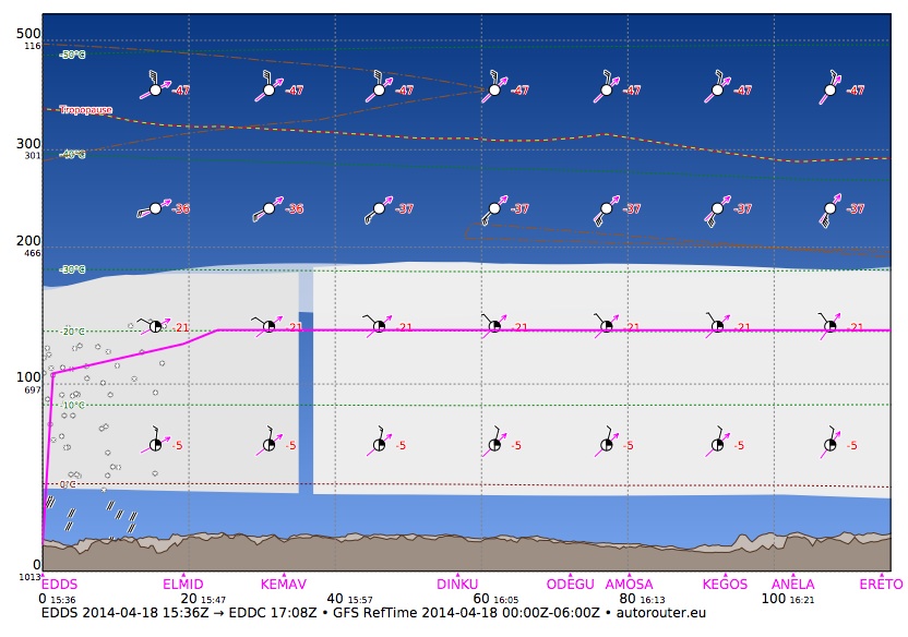
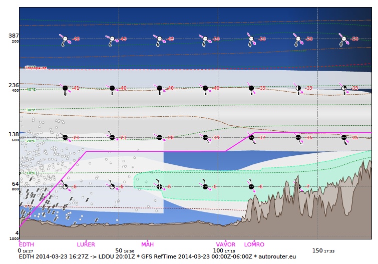
This page shows you the first 120 NM of a flight from EDDS (Stuttgart, Germany) to EDDC (Dresden, Germany). The horizontal axis is the distance from departure in nautical miles and the Zulu time. The vertical axis shows the flight level (altitude) in a logarithmic scale (to be correct, it actually shows pressure in a linear scale which you find as a smaller number below the flight level). The horizontal and vertical axes form a grid which is shown in light dots.
The magenta line is the planned aircraft trajectory so you can see that in this case, we’d cruise at FL120. Along the horizontal axis you also find the waypoints of the flight plan in magenta.
During daytime, the sky is painted in blue and during nighttime in black with a gradient showing twilight during dusk and dawn.
Reference data
![]()
The information line at the bottom of the chart is very important as it contains the date and time of the flight and the weather data used. The GFS data is updated 4 times a day and it is important to verify which data was used.
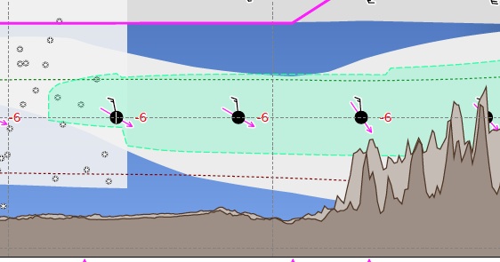
Terrain
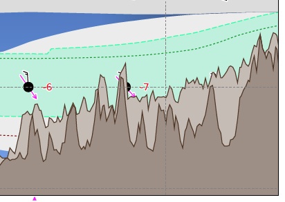
At the bottom of the chart, the terrain is depicted in dark brown and light brown. The dark brown line shows the terrain below your planned flight path and the light brown line the highest terrain feature within 5 NM of your flight path. We rely on the freely available topography data from the Shuttle Radar Topography Mission (SRTM), again a service from the United States government which is available in the public domain.
Temperature lines
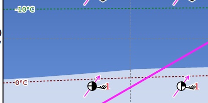
In the chart, you find several more or less horizontal lines of different color. These depict temperatures (“isotherms”). The most important one is the 0°C line in red because above that line, icing is possible. Below and above the freezing line, you will find additional isothermal lines in green color for every 10°C difference.
In case of an inversion, there is higher temperature at a higher level. In combination with rain, this can create one of the biggest hazards to aviation: freezing rain. Therefore watch out when you see positive temperatures above a layer of negative temperatures.
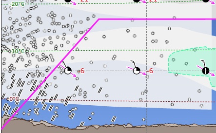
Clouds
In meteorology, a cloud is a visible mass of liquid droplets or frozen crystals made of water or various chemicals suspended in the atmosphere above the surface of a planetary body. Sounds logical so far. Our GRAMET shows clouds where there the model shows condensation, even if it is just a quarter. Ogimet’s GRAMET only shows clouds when there is at least 50% coverage, something we found to be overly optimistic because you could end up flying in those 25% that the model does not show. The cloud coverage is shown in eights as part of the wind vector with the following standard model (“sky obscured” only applies to met observations, not to forecasts so it will not show up in a GRAMET).

The cloud themselves are drawn as gray shaded areas with overcast being dark gray and 25% coverage being light gray.
The underlying GFS forecast model separates clouds into three altitude levels: low level, medium and high. You can often see this in the GRAMET display and you should be aware that it is a source of possible inaccuracy because in real life the clouds don’t know that there are only three levels where they are supposed to be! Other weather models (such as the European COSMO) use more levels of clouds.
Icing
Icing is possible when the air temperature is below 0°C and there is visible moisture in the air. The red dotted line shows the 0°C line. If the line is well above the terrain, then there is a good chance that you can descend into warmer air after encountering icing and melt off potential airframe ice during the approach. Again, our disclaimer from above applies.
It is very difficult to predict when icing occurs. Most meteorologists say that icing is possible between 0°C and -20°C, below that temperature clouds usually do not contain supercooled water droplets that turn into ice upon impact. Based on the forecast moisture and temperature, we predict icing and mark it with a green shaded area. In the above example you notice an area of probable icing. As you approach the mountains, the zero degree line and thus the icing is below the elevation and you clearly do not want to be in that area. The magenta flight path stays above the icing but it is still a concern because the icing could reach higher and in case of a forced landing, the terrain is forecast to be overcast and in icing. This is a situation where you might want to have two engines, a ballistic airframe parachute or decide to not depart on the flight.
The formula used to predict icing was developed by Ogimet and takes several atmospheric conditions into account. A separate icing index for layered (stratiform) and convective (cumuliform) clouds is calculated and then combined into a single icing index:
Icing index = (% of layered cover * layered index + % convective cover * convective cover) / 200
The icing index for layered clouds is determined as follows:
Layered index = 100 * -t * (t + 14) / 49
where t = (air cell temperature in Kelvin - 273.15); when -14 <= t <= 0
And the icing index for convective clouds in the following way:
Convective index = 200 * (water_vapor_density(bottom_of_cloud) - water_vapor_density(air cell)) / water_vapor_density(20°C saturated air) * sqrt((T- 253.15)/20.0)
when 253.15 <= air cell temperature in Kelvin <= 273.15
An icing index between 30 and 80 is considered as moderate, a value above 80 as severe icing.
Wind
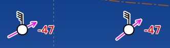
Throughout the chart, you will find a grid of wind symbols. These give you a lot of information. The circle in the middle shows the cloud coverage in quarters, in the above example there would be no clouds. The barb attached to the circle is the wind rose with the standard symbol. The above example shows 35 knots and 30 knots of wind coming from north. The magenta array shows the aircraft’s movement relative to the direction of the flight (hence magenta). In this example the aircraft flies on a north easterly course and would experience a headwind coming from the left. The number right to the wind symbol is the temperature, -47°C in our example.
Strong Winds and Turbulence
Areas where there are strong winds are surrounded by brown lines, called isotachs. These lines are made up of alternating dashes and dots and the combination of the two specifies what they mean. Strong winds are winds of at least 25 knots. A dash and one or more dots show strong wind is in 25 knots increments. A dash and a single dot signifies 25 knots, a dash followed by two dots 50 knots and a dash followed by 3 dots 75 knots.
Atmospheric turbulence are irregular air motions characterized by winds that vary in speed and direction. Turbulence is usually a condition of convective clouds but can also appear outside of clouds and is then referred to as clear air turbulence (CAT). GRAMET depicts areas of forecast turbulence using two dashes for moderate turbulence and two dashes followed by a dot for severe turbulence. To determine the level of turbulence, a formula is used taking the horizontal and vertical wind shear into account, whereby the horizontal wind shear has a linear influence and the vertical wind shear a square influence. The formula as developed by Ogimet is
E = (5 * horizontal shear + vertical wind shear ^ 2 + 42 ) / 4
Horizontal wind shear is given in meter per second per 100km and vertical wind shear in meter per second per 1km. Values of E between 80 and 160 are considered moderate turbulence and values above 160 severe turbulence. If E is above 80, the areas inside the corresponding isotachs are shaded in brown.
Simply memorize: a single dash means wind in 25 knot increments and two dashes mean turbulence.
Precipitation
In meteorology, precipitation is any product of the condensation of atmospheric water vapor that falls under gravity. Rain, snow, hail, etc. We depict these using easy to read symbols: snowflakes for snow and two parallel lines for rain. A situation where rain falls above the 0°C line indicates a danger of freezing rain.
Thunderstorms
We predict thunderstorms by the “lifted index” (LI) of air cells. When this index indicates a likelihood of thunderstorms to occur, we print the likelihood next to the thunderstorm symbol using the following classification:
- LI >= -0.5: unlikely TS
- LI >= -3.5: possibly TS
- LI >= -5.5: probably TS
- LI >= -6.5: severe TS
- LI < -6.5: violent TS
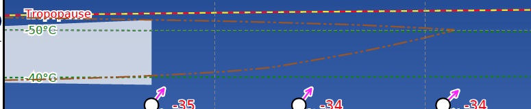
Tropopause
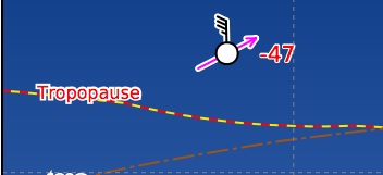
The tropopause marks the altitude above which there is no more weather. The area from ground up to the tropopause is the troposphere where we live and experience weather. Above the tropopause, temperature no longer decreases with altitude which is why clouds cannot pass the layer. In winter, it is lower than in summer. It is mostly of concern to jet pilots because they can reach altitudes above the tropopause and use this information to determine whether they will be able to overfly potential thunderstorms.